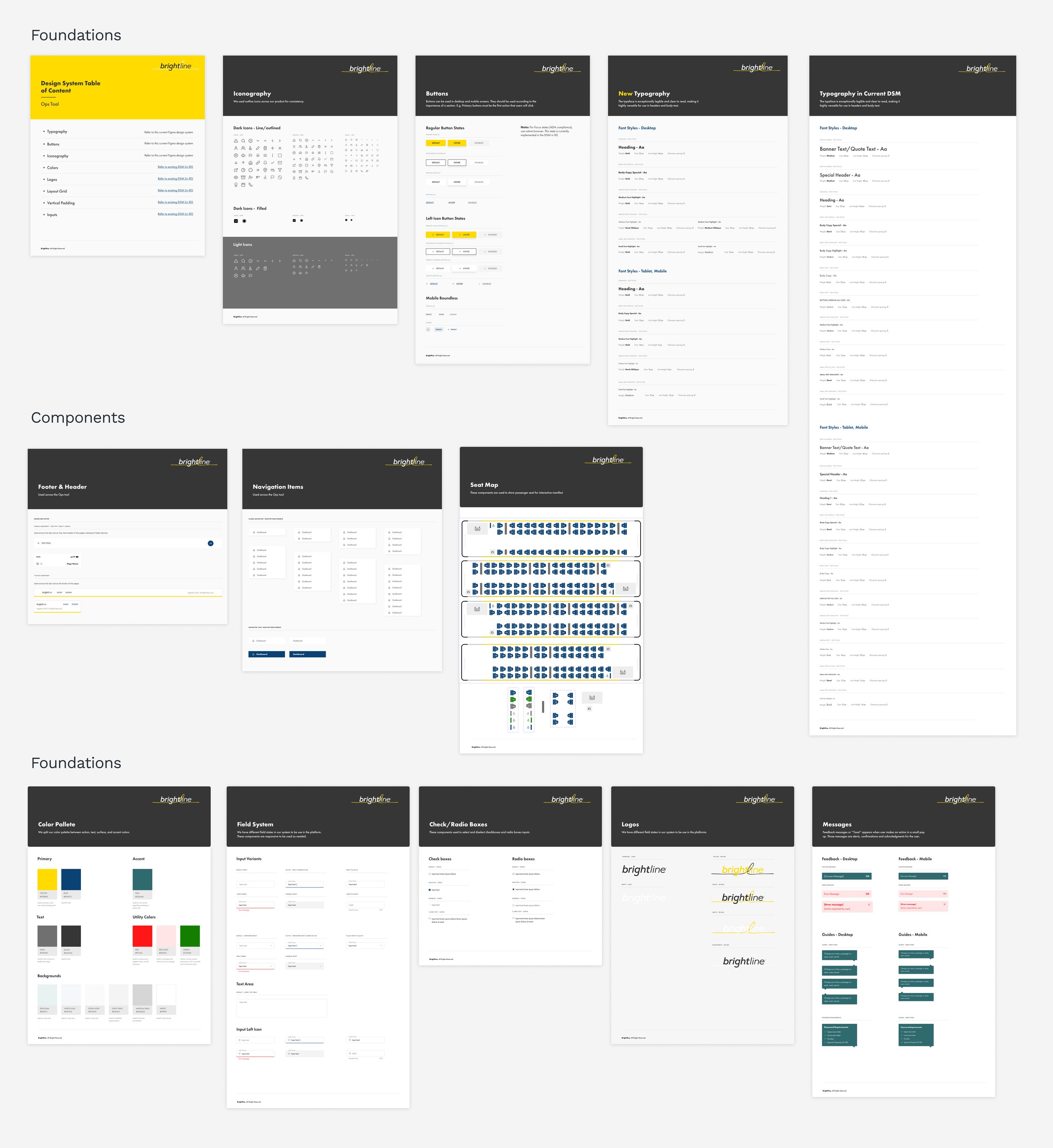

Brightline Ops Tool

Challenge
Brightline needed a better integration tool for the internal team of their company, "Opetationals Tool." In addition, a digital platform that could provide security and better visibility for the different roles within the stored information.
Solution
The team and I conducted an extensive discovery phase which informed our vision, strategy, and visual concept for the Opts tool—then worked closely with internal stakeholders to translate the insights into a consolidated and improved platform that provides a better experience for internal teams.
What We Did
Curation Sessions with Stakeholders
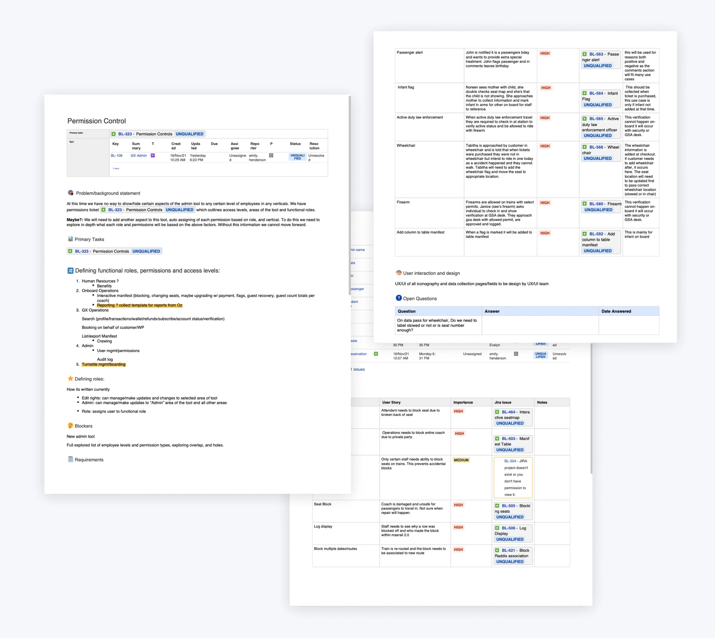
The product and project manager of the team met week by week with Brightline Stakeholders to define goals, following efforts, development requirements, and user needs to determine the platform.
• User Personas: Onboard Train Attendants, Security Internal agents, Admin Roles.
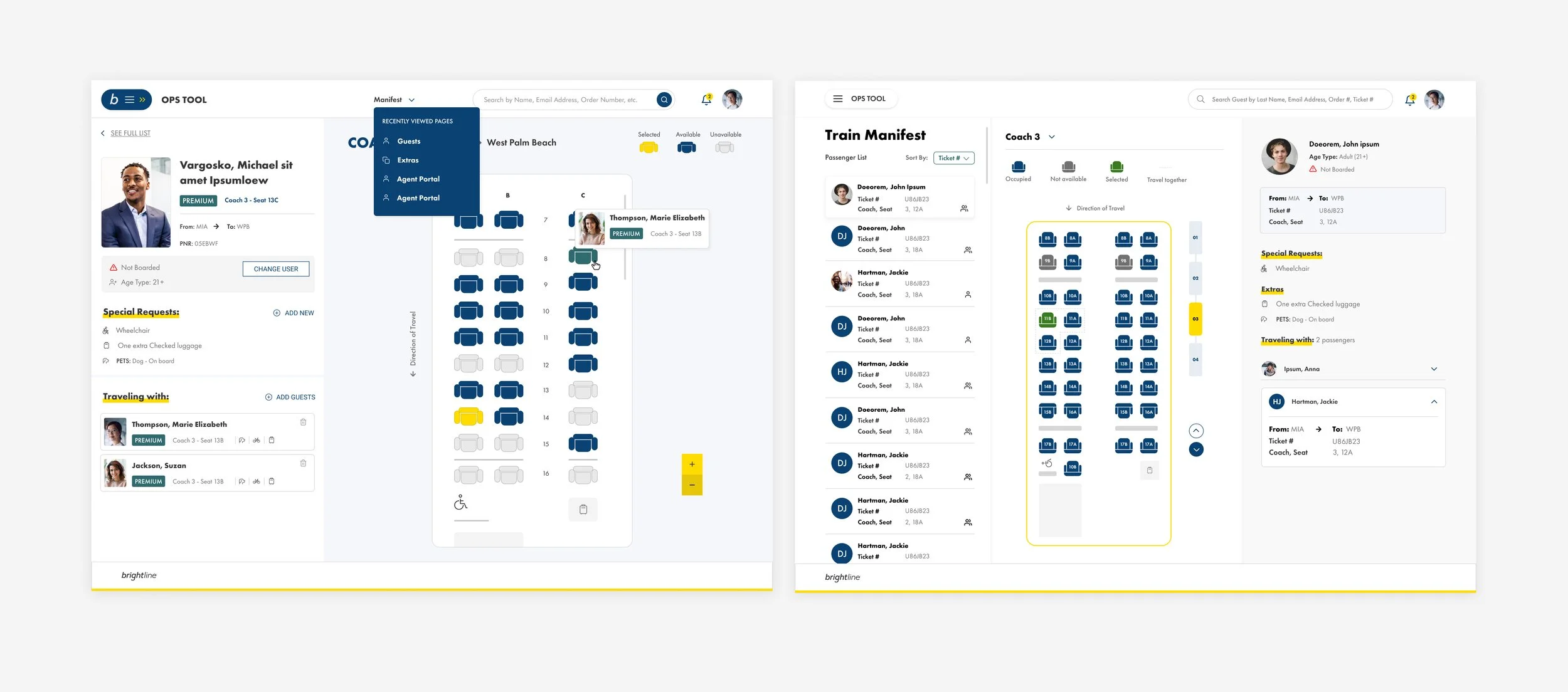
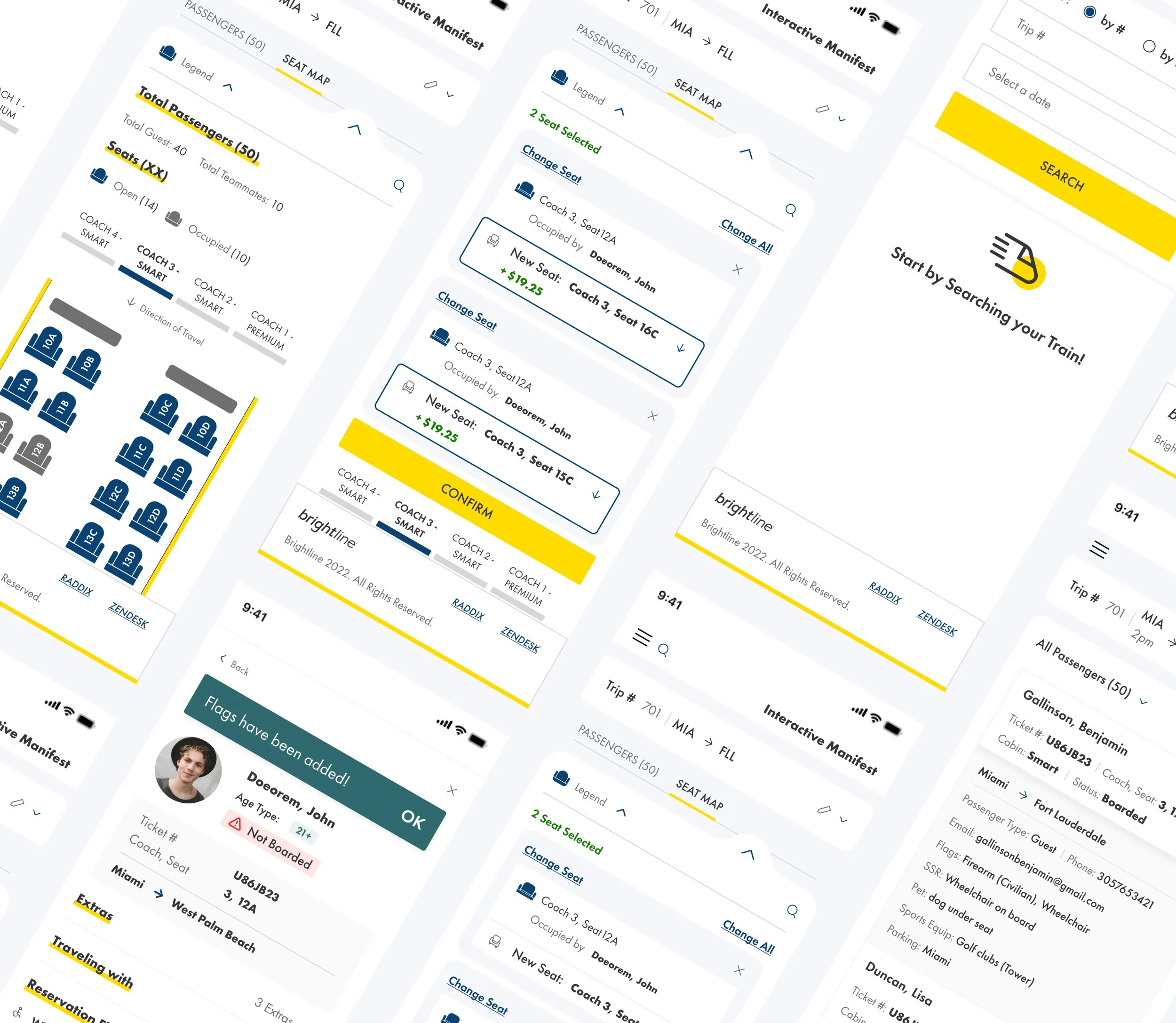
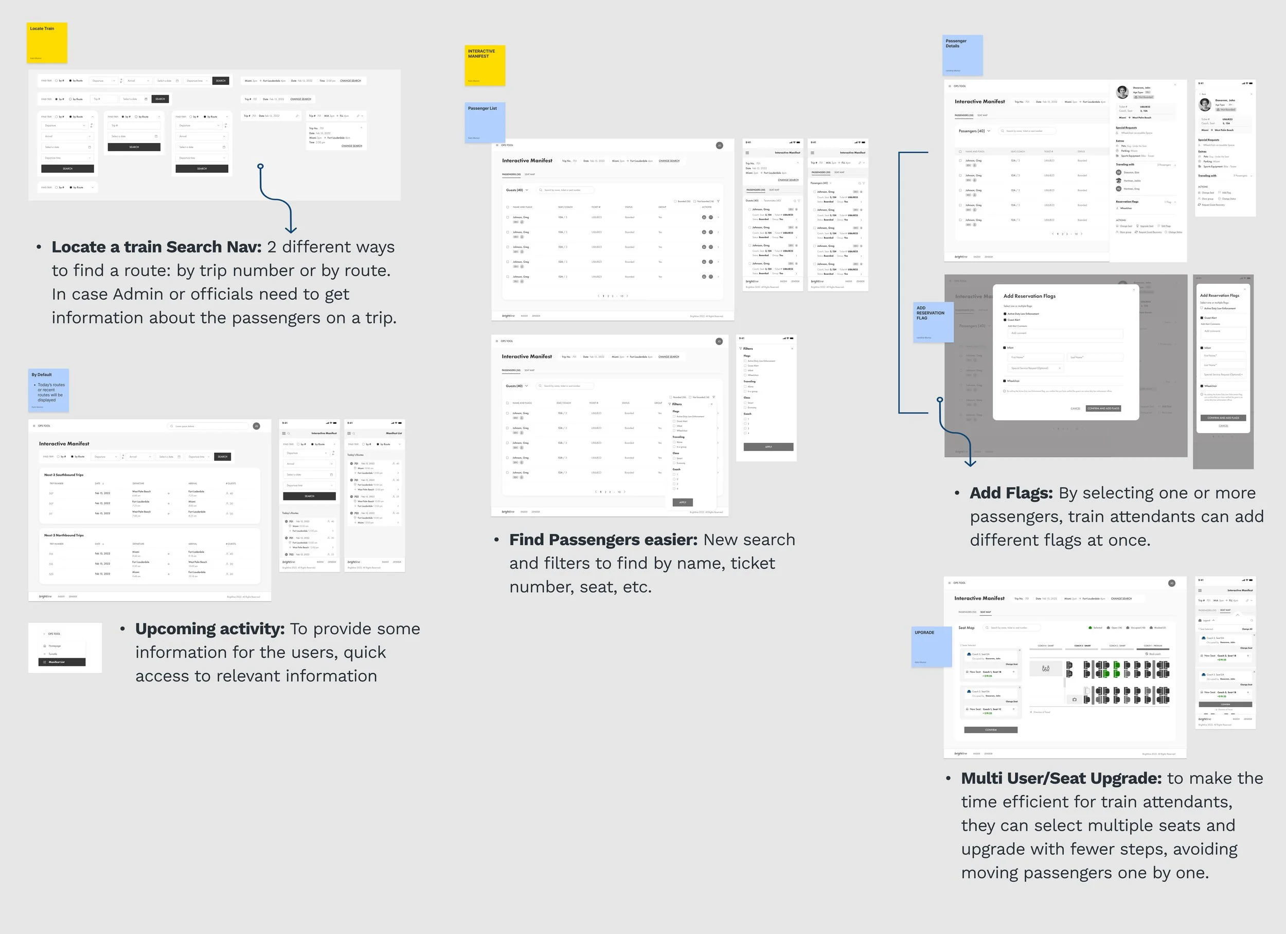
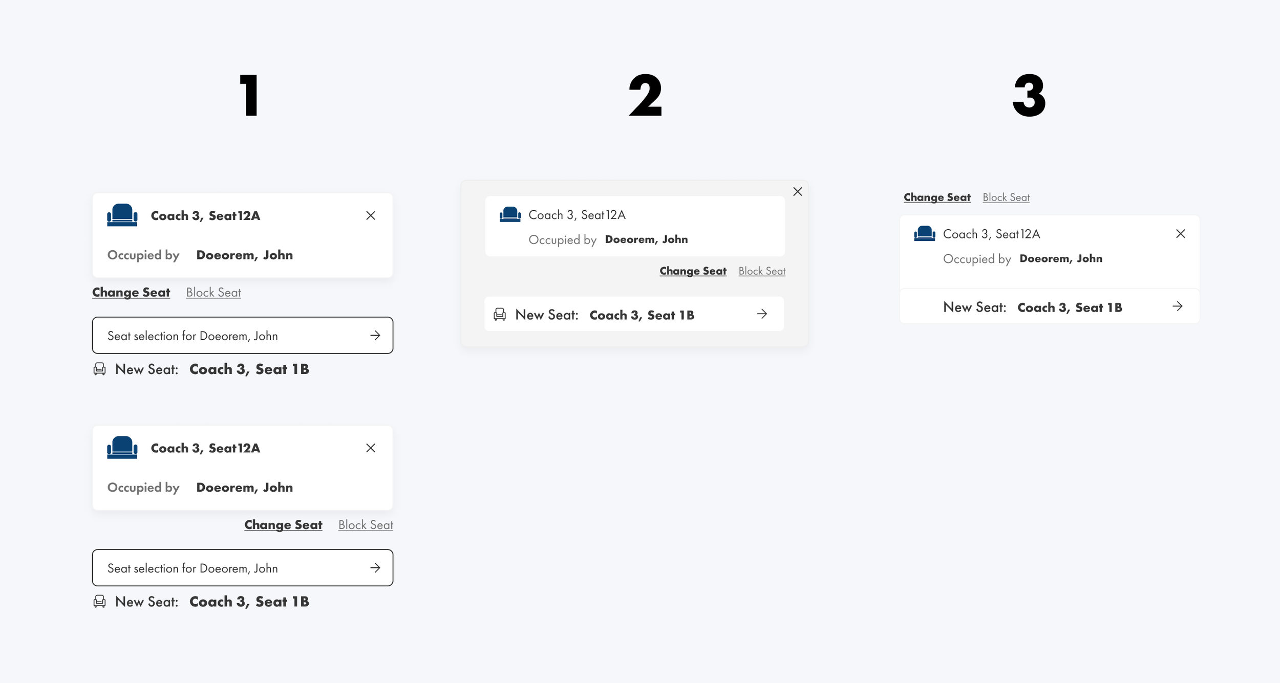
• Train attendants need to have tools like: Add different passenger flags like a wheelchair, infants, firearm onboard; the exact location of passengers to make upgrades or changes.
• On the management side: locate a specific train, create permissions per role to access the platform, and history log (for security).

Persona Description: Onboard Server/Train Attendant
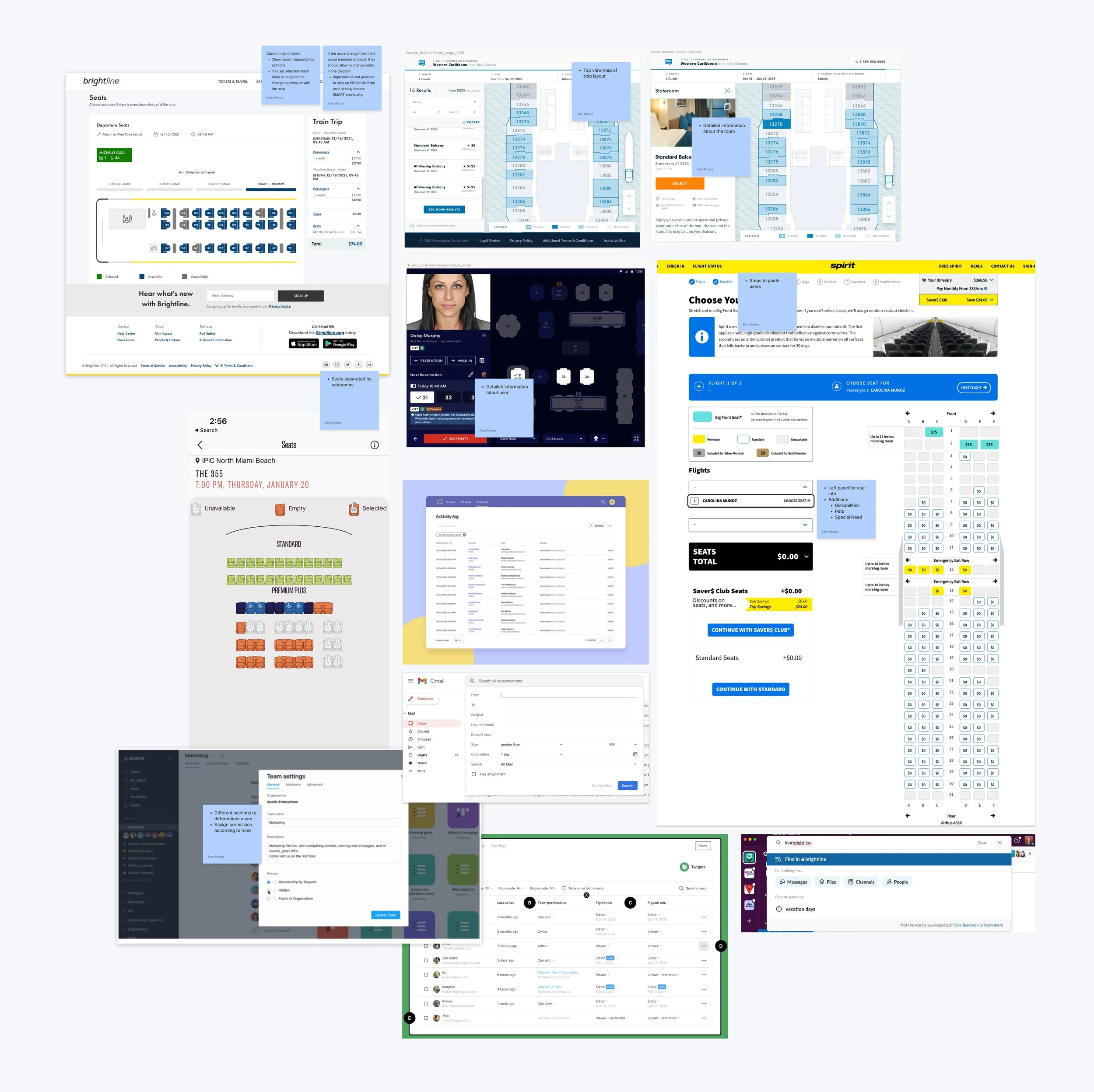
Competitive Analysis
• We audited the current user-side platform to re-use some of the elements of that experience. As a result, it saves time in development, and the team is familiarized with this experience already.
• Left side navigation so see details about a passenger or whole guests in the train.
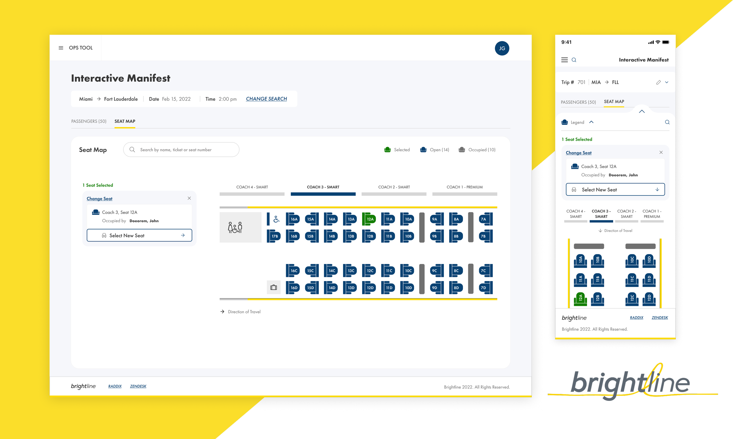
• Flights and cinema digital seat map experience inspiration.
• Smart search from “Slack” to create a global one that finds quicker a specific part of the platform or a passenger if that’s the case.
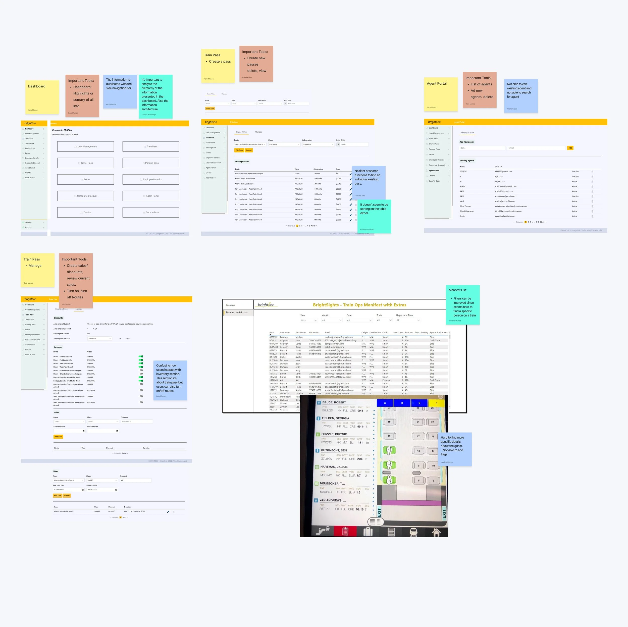
UX Audit
• It’s essential to analyze the hierarchy of the information in the dashboard. Information seems duplicated.
• Important tools across Create, review, edit info, delete, filter or search to locate specific information, turn of/off routes.
• The Filters on the current Manifest list are hard to use since finding a specific person on a train seems complicated.
• On the current Interactive Manifest: it’s hard to find details about the guest. It’s not possible to add passenger Flags.
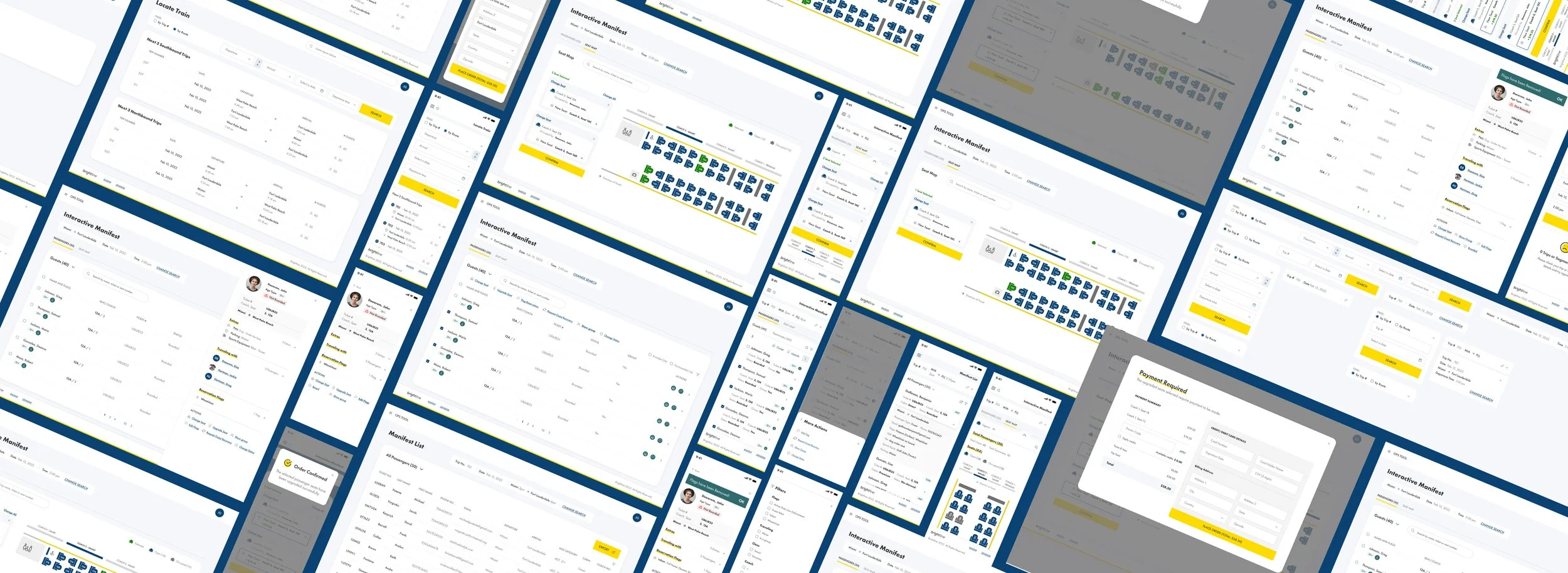
Wireframes
Week by week, in an agile methodology and brainstorming/collaboration sessions with Brightline and real users, we started to create the new wireframes of the platform, adding all the recommendations we provided in the UX Audit and all the learnings from different documents.
Improvements: Better use of Space
• Since one of the users (Train Attendants) were going to use mobile devices, we needed to make the placement of the elements efficient, avoiding too much scrolling.
• Option 3 occupied less space in a phone device. Also, the users found it clear and more accessible when using it.
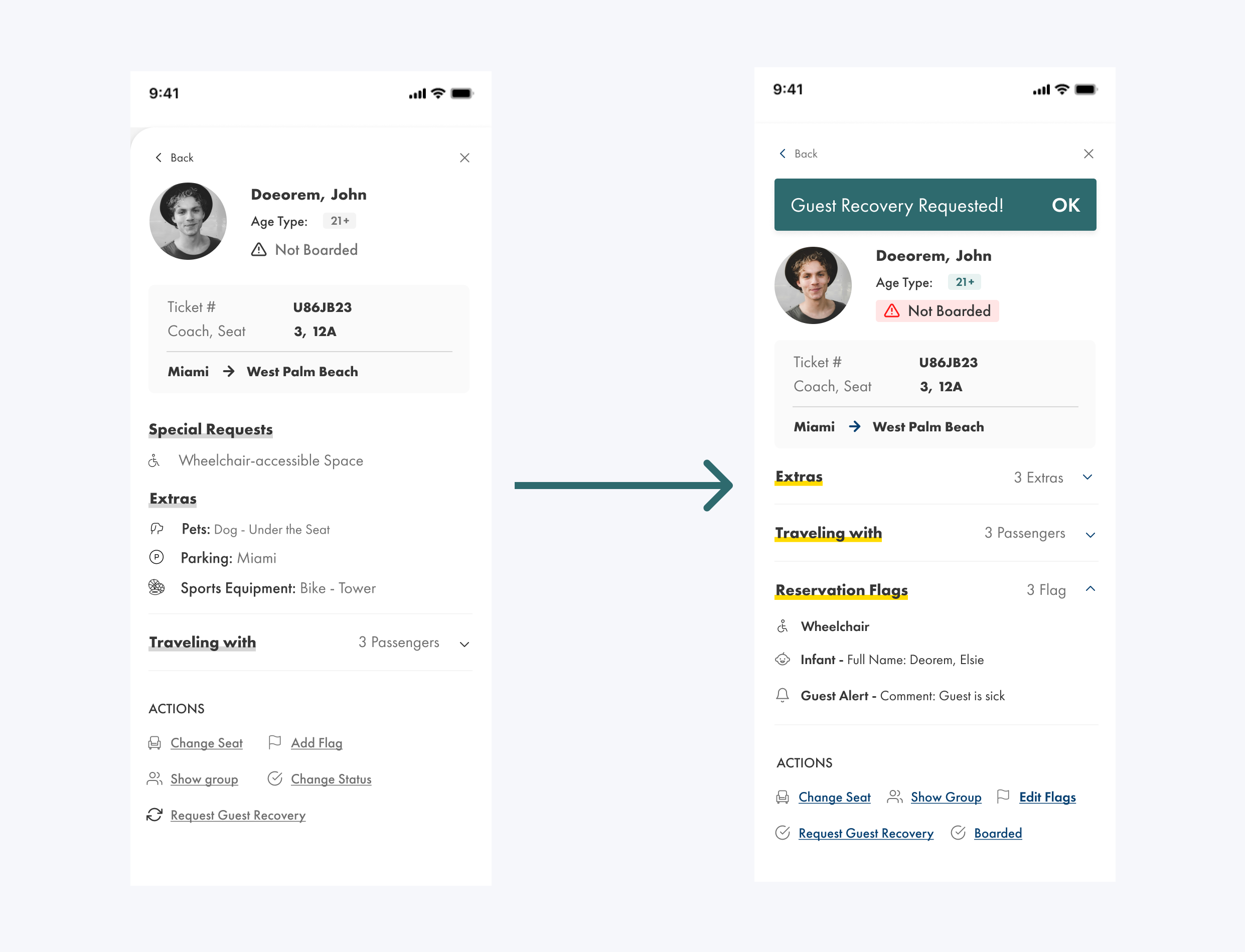
Consistency + Efficiency
• Making all sections collapsable, providing less scrolling for users, and making the web/app more digestible for train attendants while scanning through the passenger’s information.