

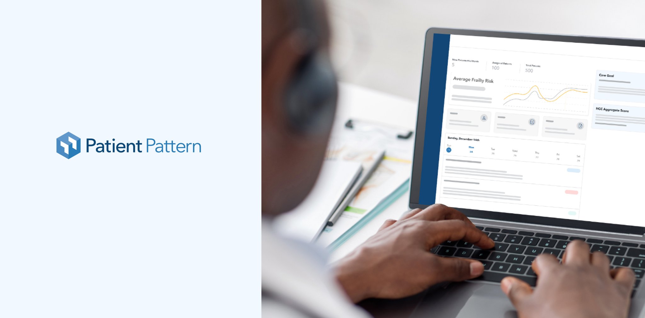
Care Coach Web App

The Challenge
Patient Pattern's cloud software Care Coach had begun as a platform to help payers and providers use the emerging practice of Frailty to help deliver greater care for geriatric patients. Through working with their customers, they discovered that the tool could expand to some of their biggest challenges that no single software in the market has addressed.

The Solution
• We decided to propose Research and Strategy to provide the best experience for the users.
• UX and iteration of the site with real users.
• Design System exploration to re-design their current experience.
Discovery Phase
We conducted an extensive and robust discovery phase to dive deeper into the current product and the challenges in the industry. With their founders, stakeholders, and customers, we identified vital strategies for the product to improve the experience and encourage behavior that would improve clinical outcomes.
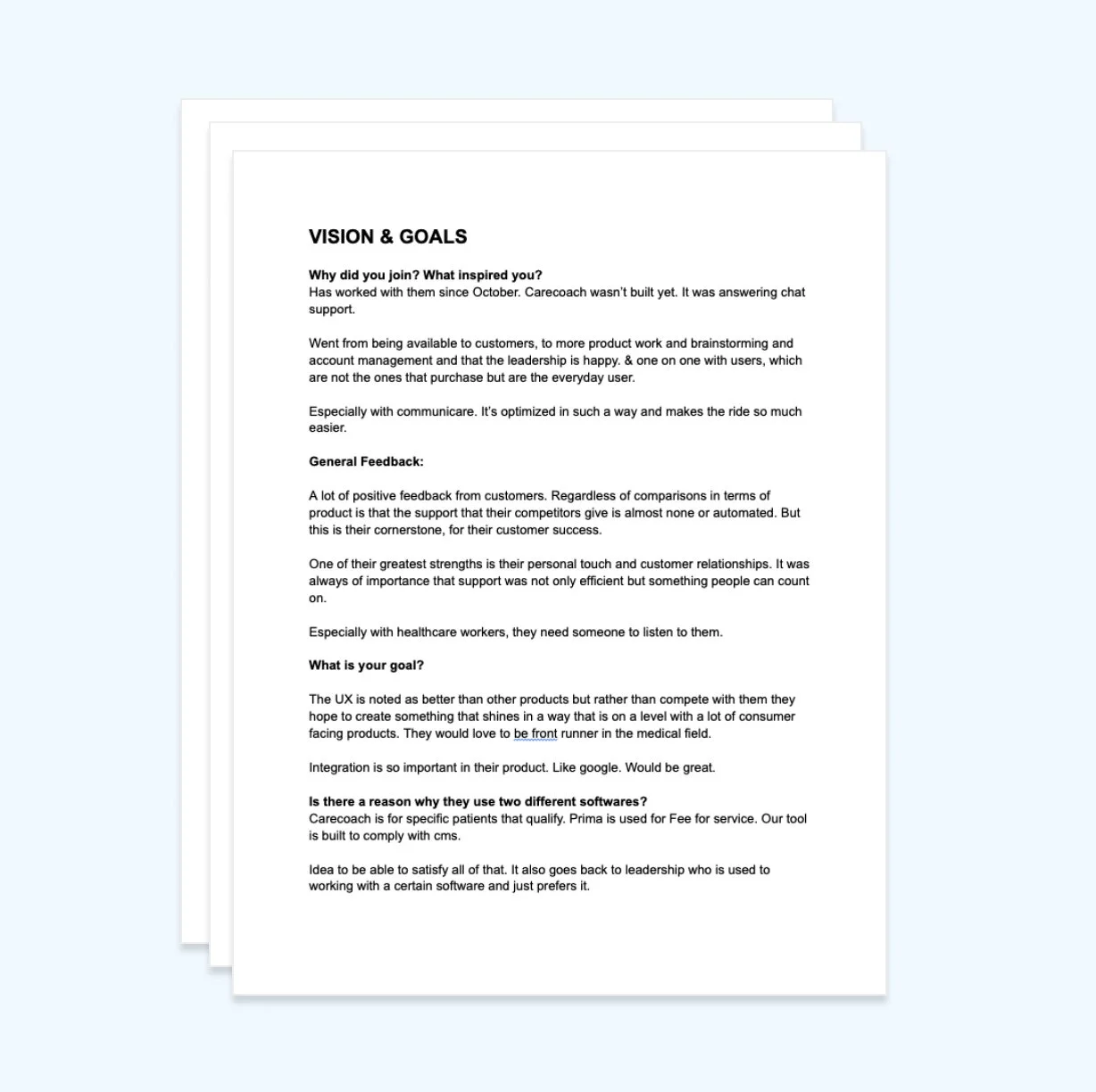
Stakeholder/User Interviews
The team helped gather business and user goals, pain points of the current solution, development requirements, and personas.
Some Findings:
• Personas: Nurse Practitioners and Doctors 30-65+ (Direct) | Older adults 65+ (Indirect)
• Industry: 64 million people have medicare. Twenty-four million are in medicare advantage. About 3.5 million are qualified for the Special Needs Program (their target)
• Primary Goal: Help to improve coding (Scores). RAFF and HCC score by 20%-30%. By creating great patient assessments, insurance and medical professionals receive fair pay.
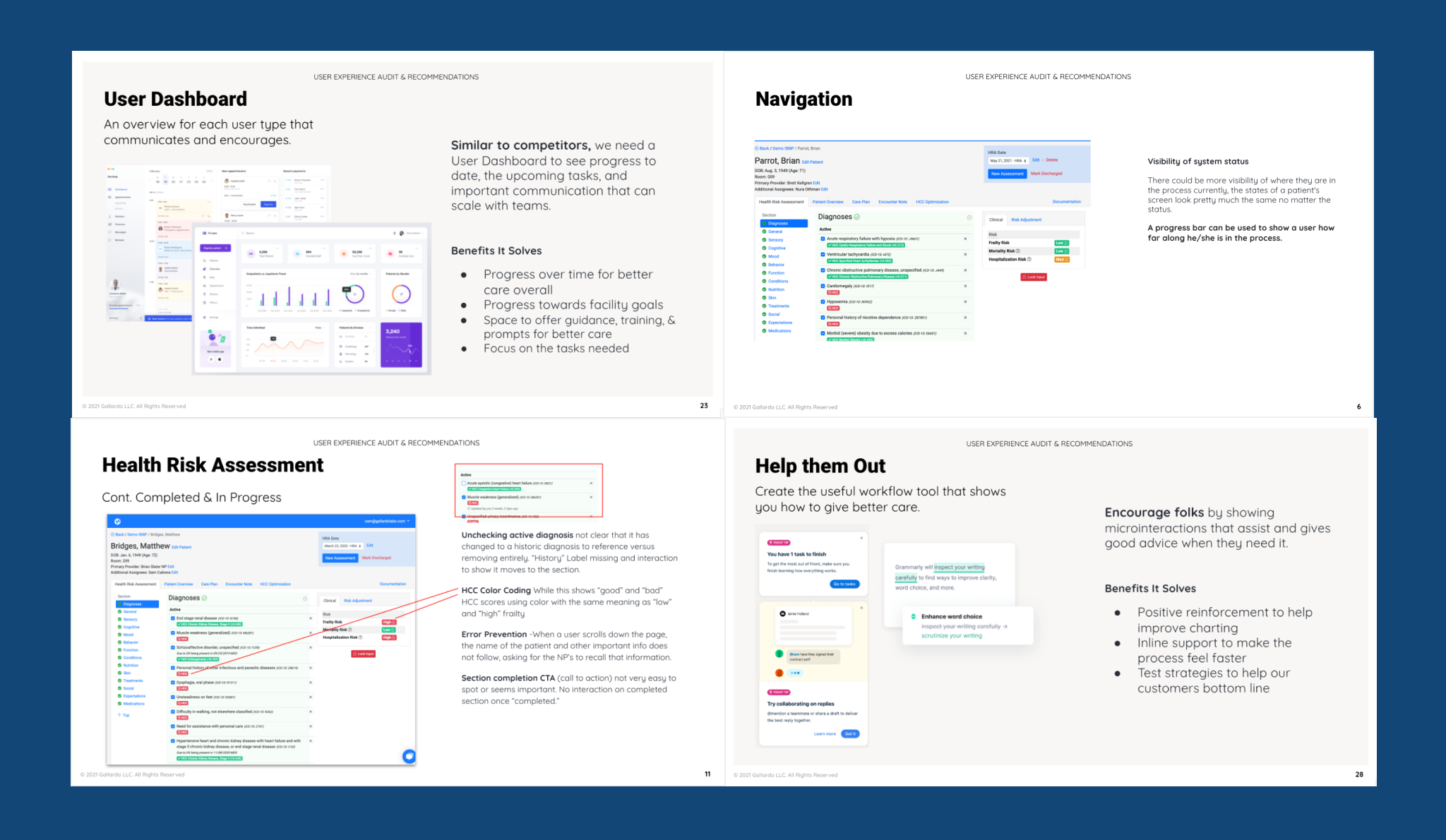
UX Audit
Followed by tons of research from direct competitors, user journeys, feature exploration, documentation in collaboration with the client, and deep analysis, we were able to bring a UX audit for the current Web/App called “Care Coach.” That way, provide best practices and recommendations that would bring new opportunities to improve the platform.
Competitive Analysis
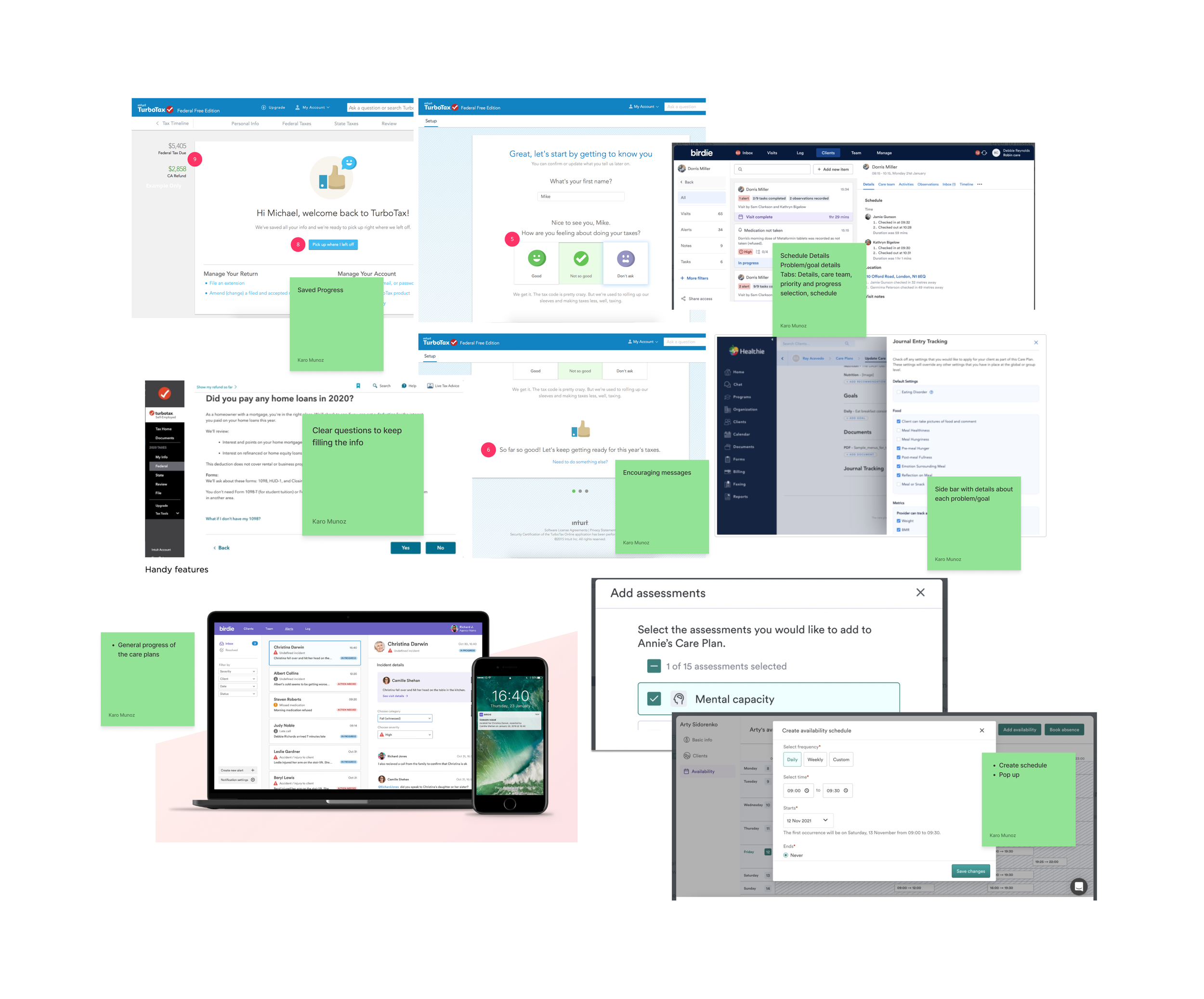
Some Findings
• Save progress feature
• Clear progress, instructions, and questions so users keep engaged while using the platform
• Encouraging messages for engagement
• Sidebars with detailed information about the patient and progress
• Schedule Features to keep track and organization across the platform and users. (Ability to assign tasks)
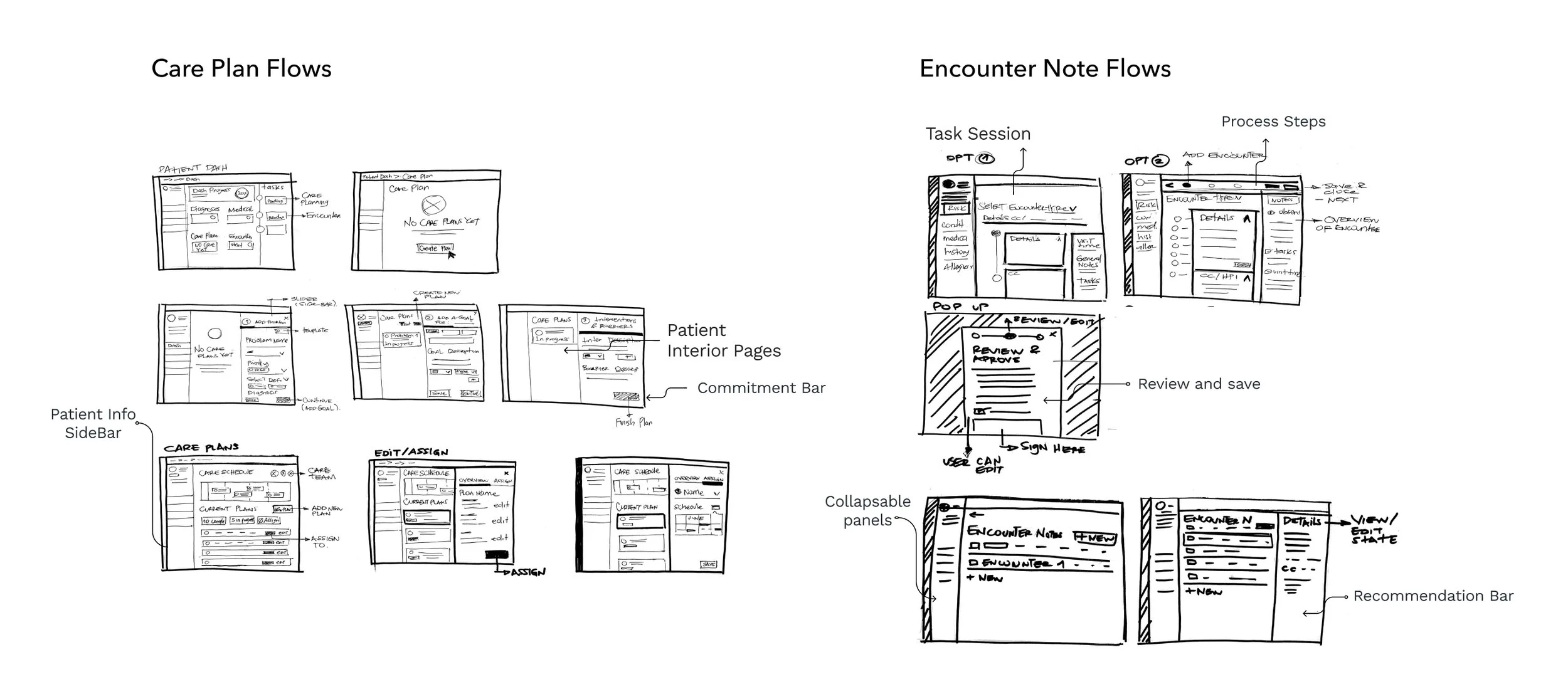
Defining Patterns
With user flows created by another team member, I started to define the interaction patterns that the different site screens will have in common with low-fi sketches. As a result, development and design time get more efficient, and users can begin recognizing how to use the platform, improving the experience.
Wireframes and Iterations
Week by week, in an agile methodology and brainstorming/collaboration sessions with Patient Pattern and real users, we started to create the new wireframes of the platform, adding all the recommendations we provided in the UX Audit and all the learnings from different documents.
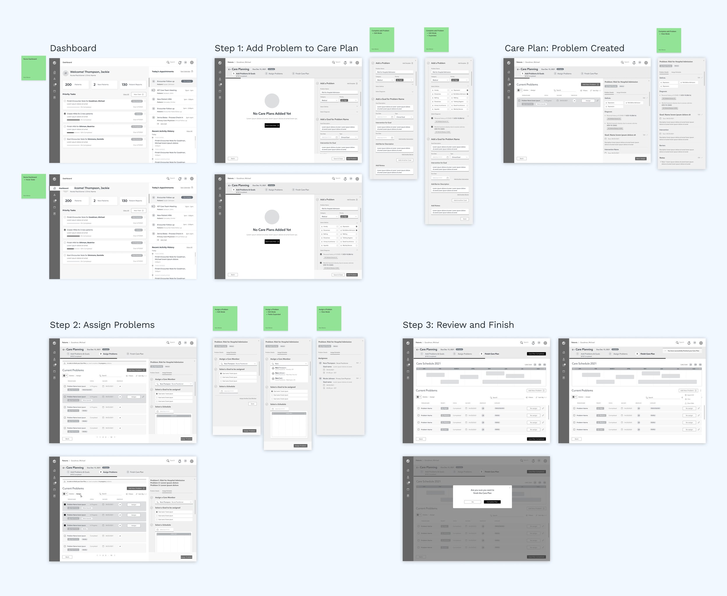
1st Round of Wireframes
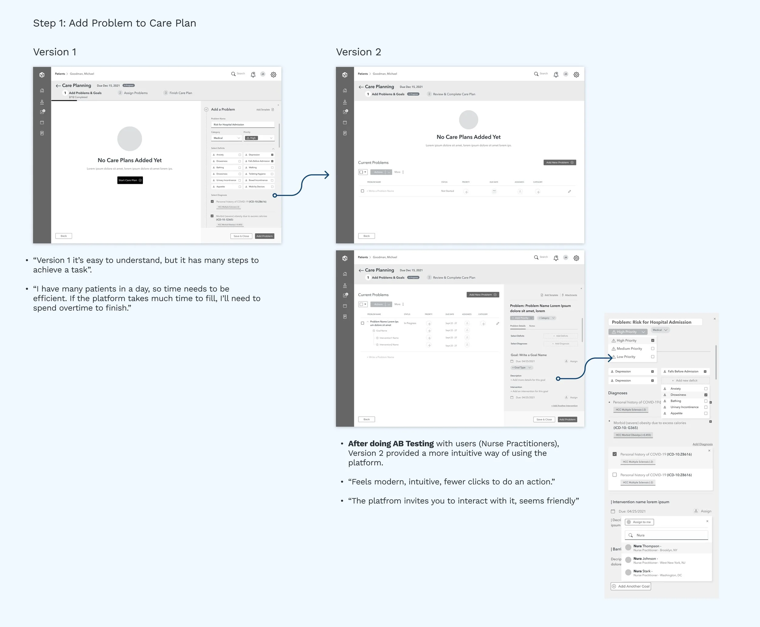
Iterations: A/B Testing
Help Users
Encouraging users by showing micro-interactions that assist and give good advice when they need it.
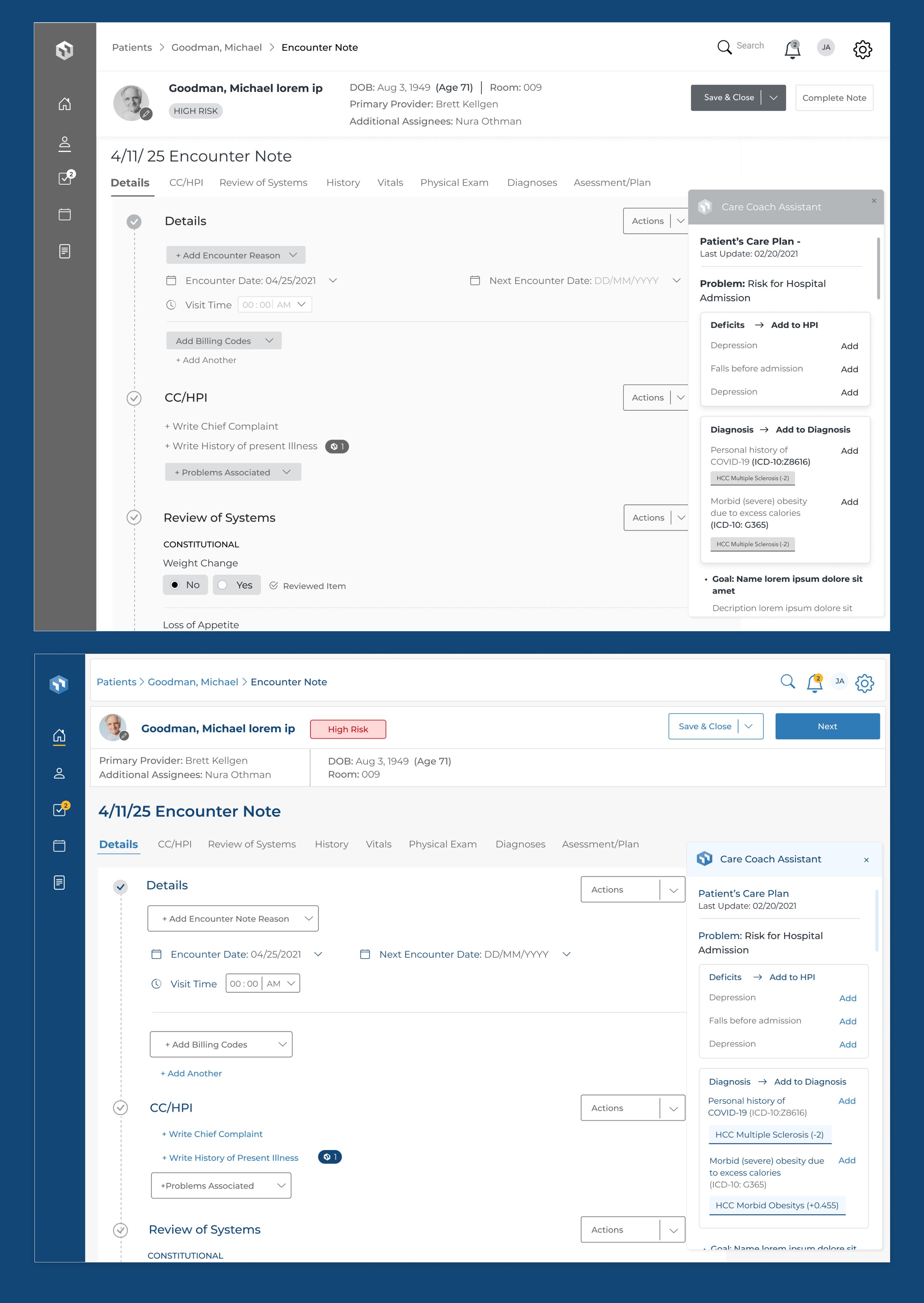
Design System
Once we had a base, we defined the platform's aesthetics and design system, which would bring a better and improved experience for users. When setting design system rules, the platform becomes easier to produce and will keep consistency in design; we created a new color palette, app components, iconography rules, typography styles, etc.
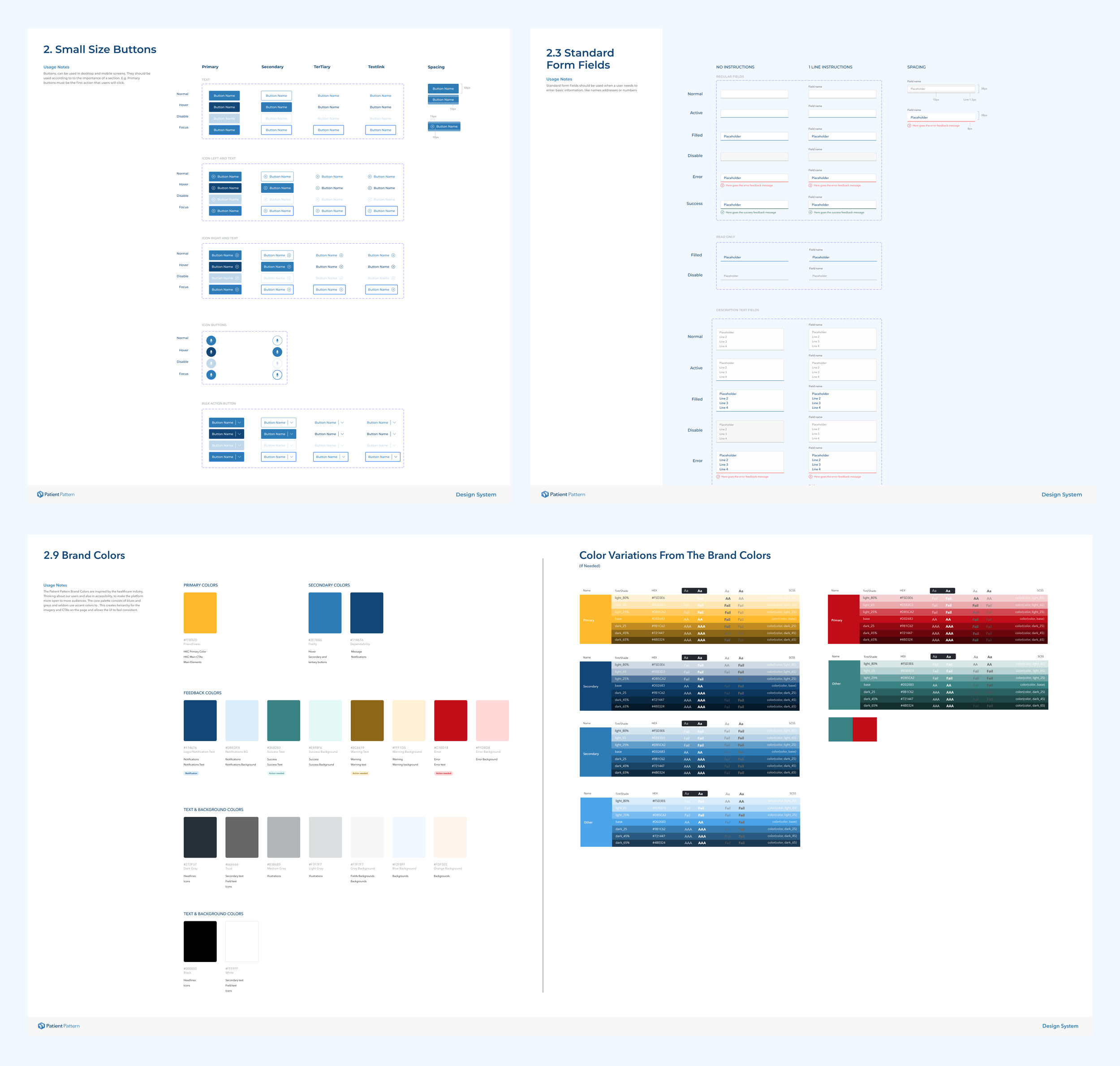
The team and I articulated the documentation provided with the analysis and inspiration research by working collaboratively with the client and following the Design Thinking methodology. As a result, a connection was built to the audience and created a lovable experience.